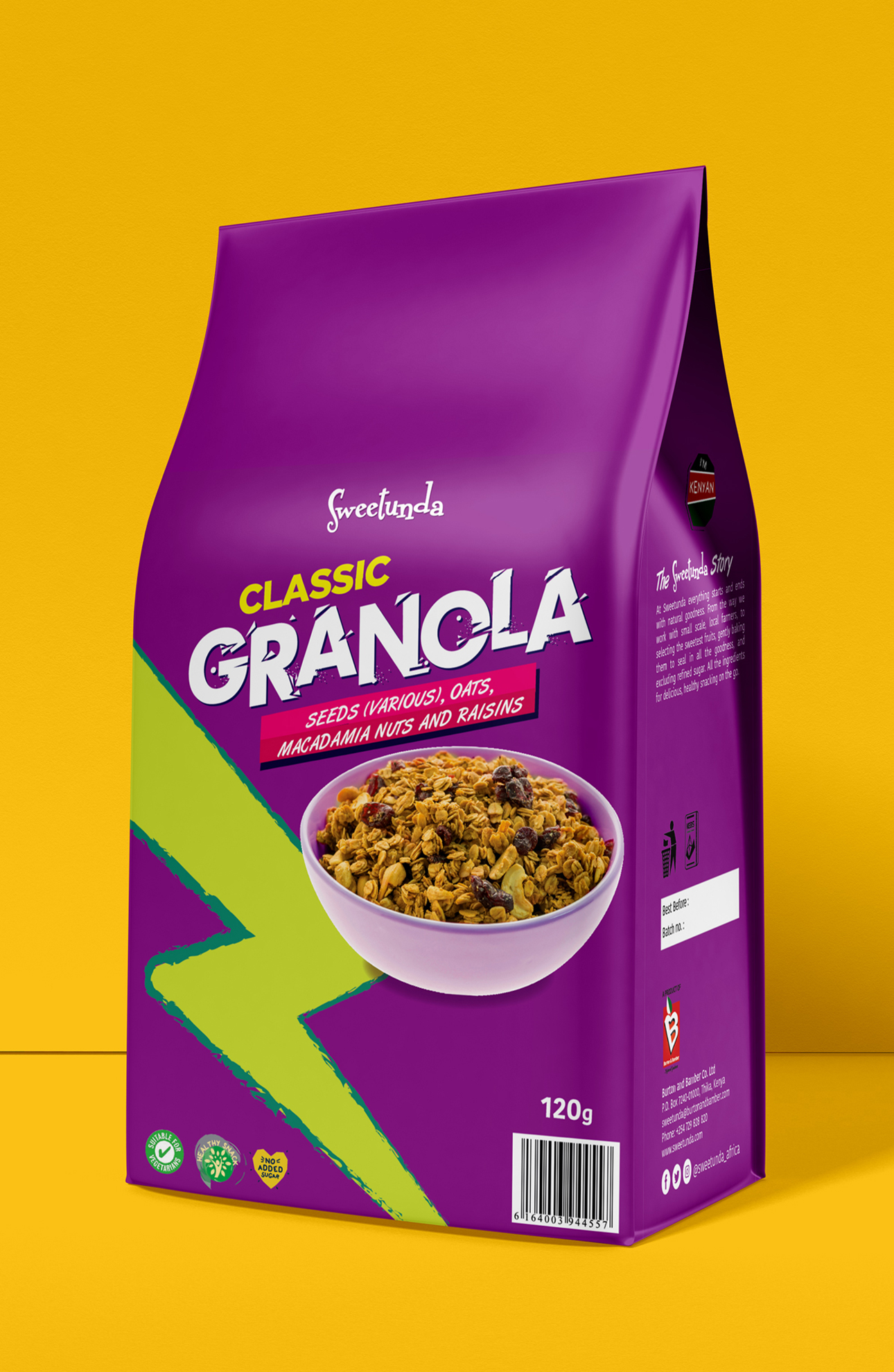
The Task
To develop a design for a series of packaging for granola with unique ingredients. Highlight a product among competitors and show its naturalness.
The Approach
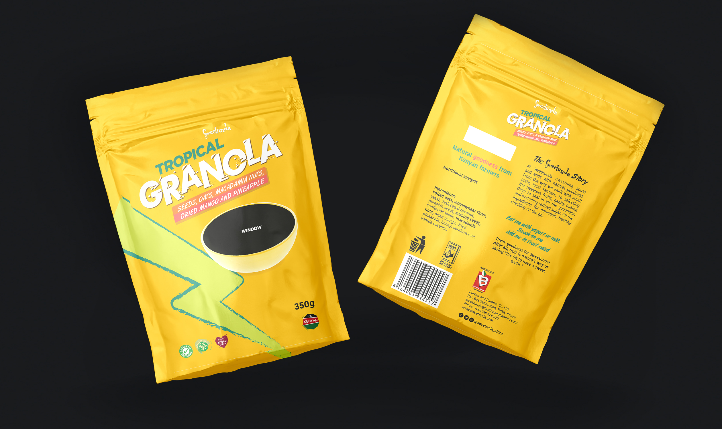
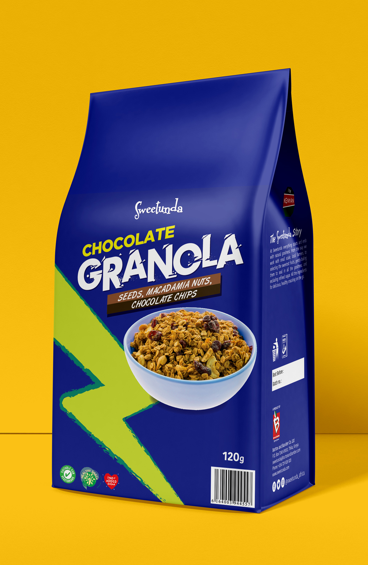
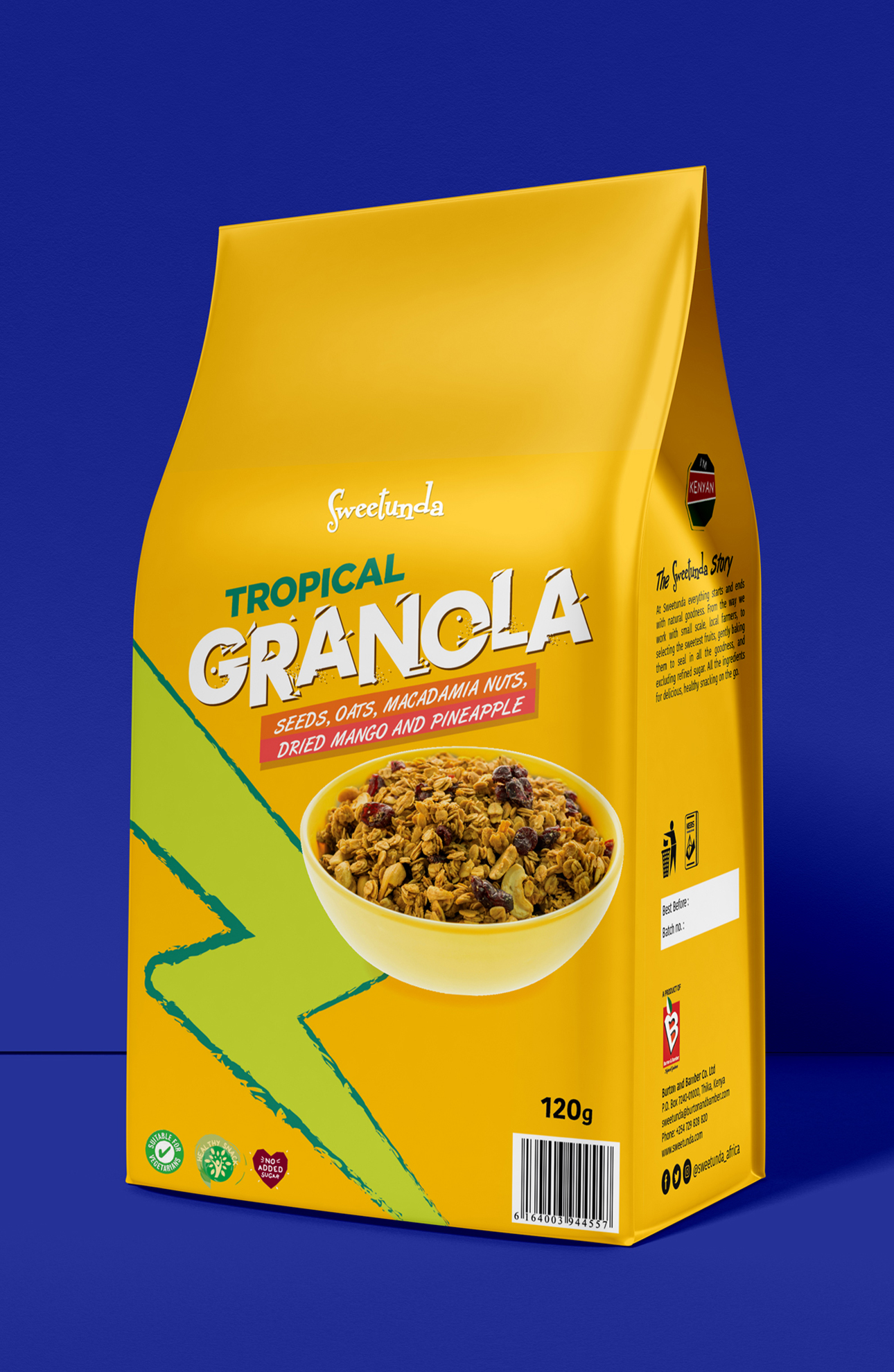
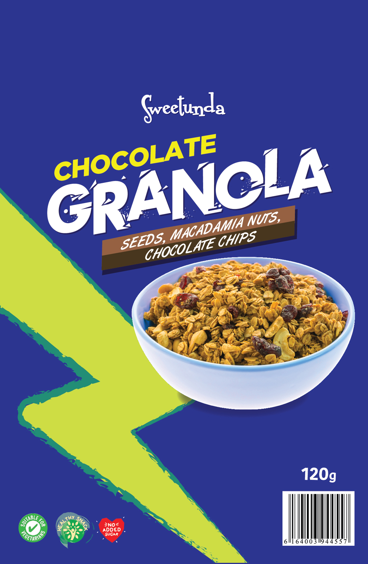
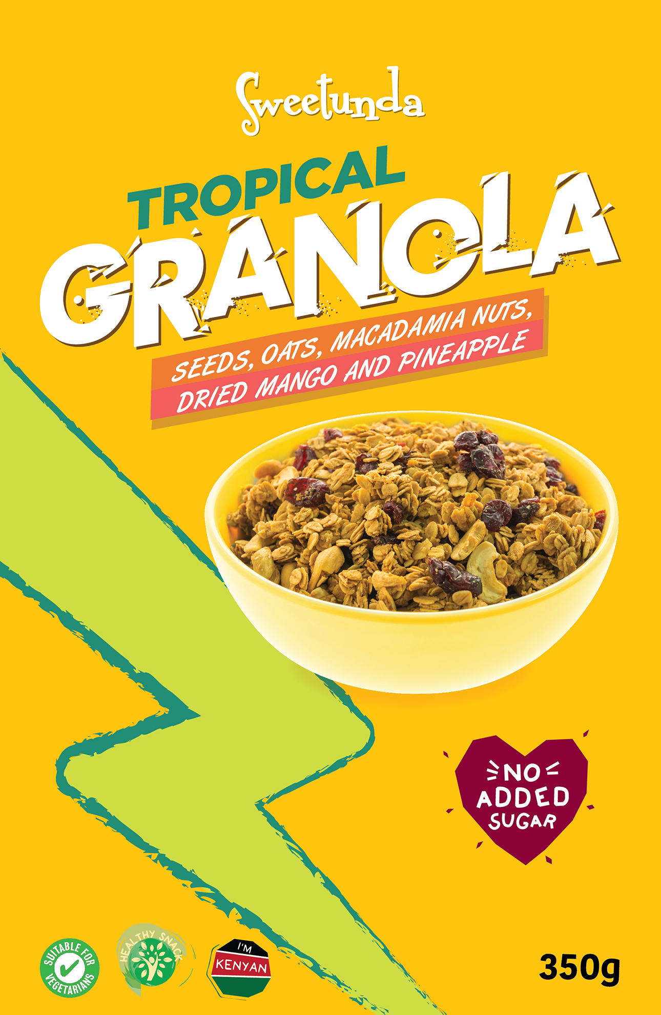
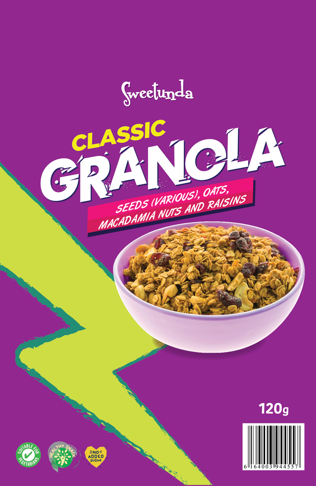
A minimalist typography solution was chosen, attention is drawn to how the product provides energy.
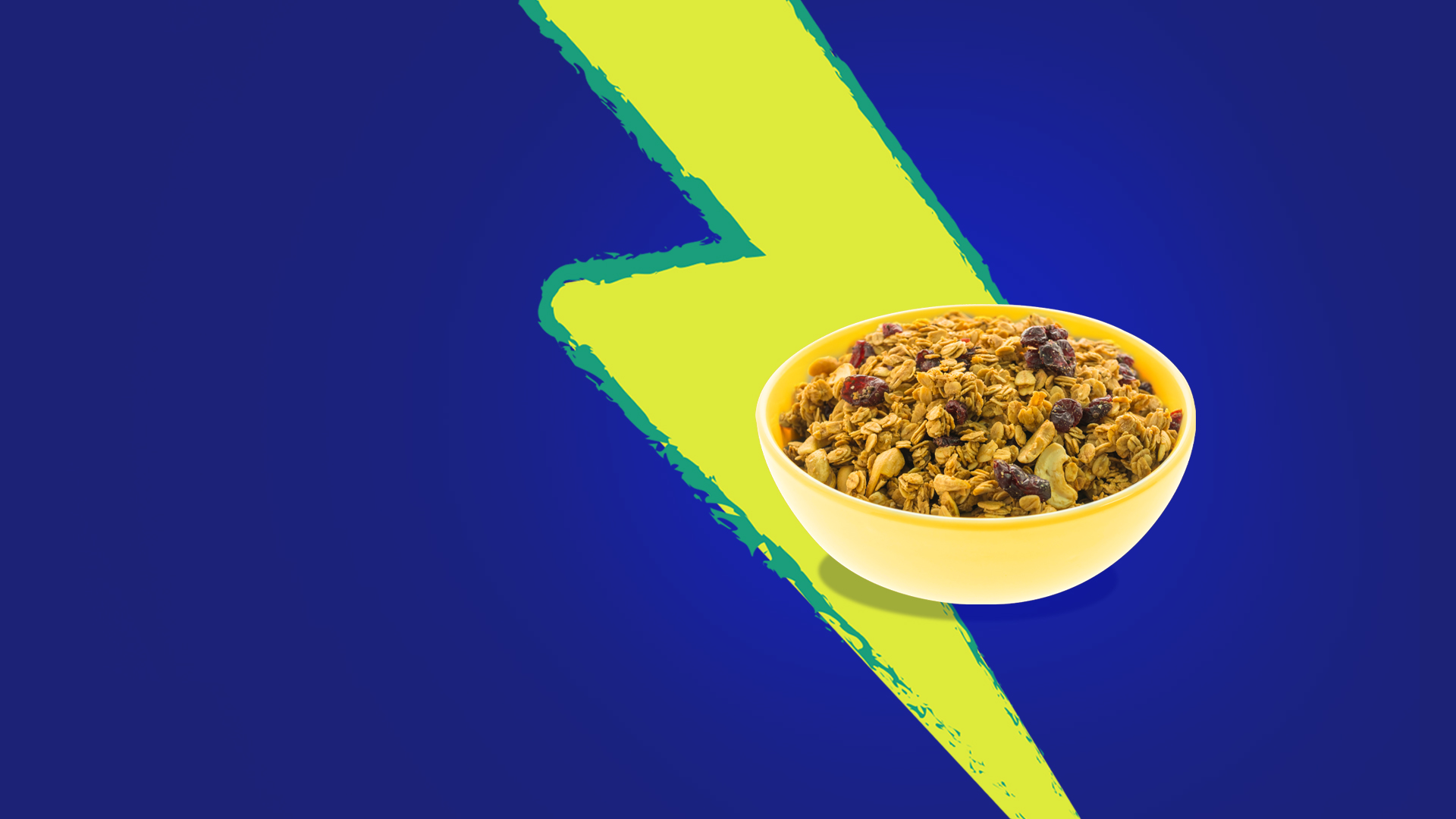
The emphasis is on bright and an attractive illustration pattern that’s consistent to each package. The highlighted word GRANOLA can be seen from long distance, drawing the attention of anyone passing by the shelf.
The stylized ‘power’ illustration evokes an emotional response from the buyer, which resonates with the naturalness of the product for providing energy & vitality. The front window interacts with the illustration and the striking colors to bring personality to the project.